
 CHALLENGE
Packaging that communicates more than good looks.
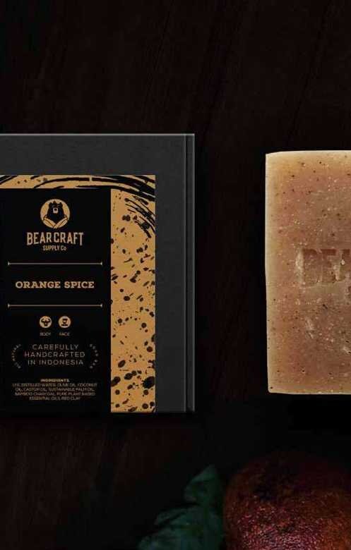
The bar-soap brand needed stronger appeal for men who travel. The work had to make each handmade product inviting while expressing adventure, eco-friendliness, and a treasure-like sense of discovery.
 APPROACH
Turning ingredients, texture, and travel into a tactile system.
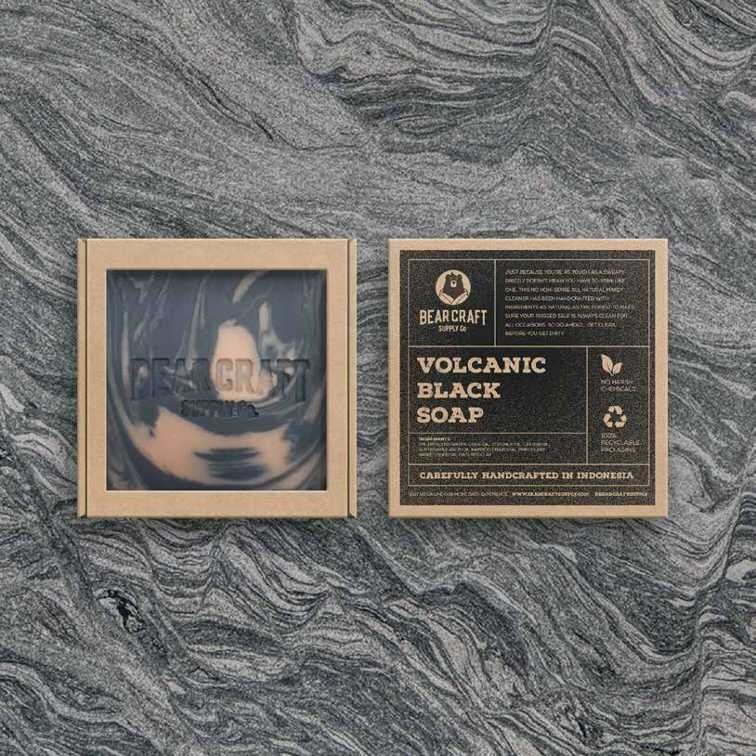
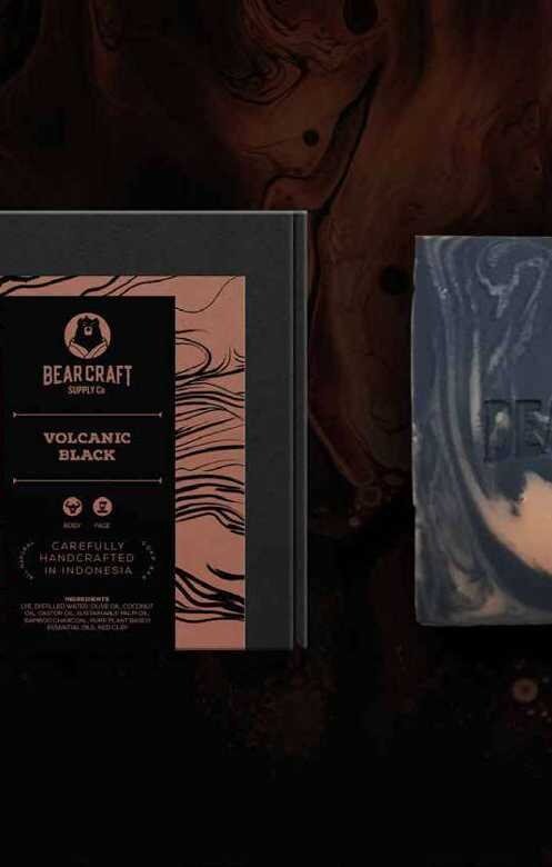
Three directions explored the brand’s adventurous character. The selected approach exposes the soap texture, uses patterns associated with each ingredient, and applies colour coding so every variant is easy to recognise.
 OUTCOME
A collectible package with an adventurous second life.
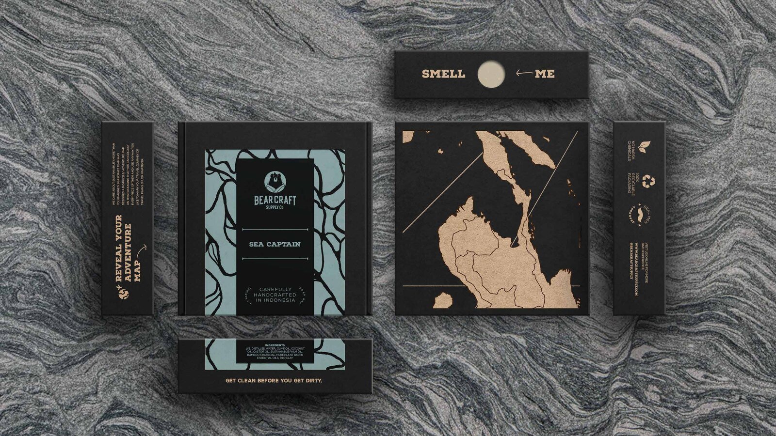
Recyclable materials and ingredient-led patterns give the range a coherent identity. A map puzzle across the side panels lets customers collect the packages and assemble them into a world map.